Showing posts with label magazine. Show all posts

Monday, 7 February 2011

Market Research:

 
This is an example of a music magazine that is already on the market, NME is an extremely successive indie-alternative-rock magazine and is sold all across the UK. My magazine should hopefully be successful in the same way, a large population of the country are between the ages of 16 and 35, this is roughly the age range my magazine is aimed at. Indie-alternative music has recently escalated in popularity so the genre of my magazine is spot-on for current music interests.
My idea is different because the cover will always be simple with the same plain header so that the image catches the eye rather than the title; I think my design of the grey-scale base colours with two or three brighter colours to contrast this works exceptionally well.
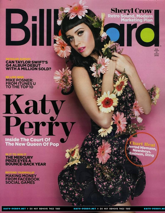
As my magazine will focus mainly on up and coming bands this will also open up new ideas and inspirations to the public, whereas Billboard will feature particularly famous people. NME has a mix of both of these and I have taken a lot of inspiration from this magazine for my draft, I think the success of NME is something to look further at and work out why it's such a huge name now.
Similarly to Billboard, my magazine will have little writing down one side of the cover; I think this stands out well and outlines the image in the centre of the page. However Billboard is an American based magazine and has been produced for more than the last 100 years, they feature the top selling albums worldwide whereas my magazine will focus on new, fresh music.

Sunday, 6 February 2011

Camera Angles/Shots:


Close-up: A close up image is when the frame of the photo is taken up almost entirely by the person/object/feature of the image; in this case it's a person's face. Close ups work well in magazines as it allows extra detail on images showing the reader more, for example if there is an article on a new up-coming celebrity they may well have a close up image to show the audience their face so they become memorable. I have used a close-up image on the contents and double page spread pages of my draft, this is because the band I am focusing on are new to the world of music and the audience of my magazine will recognise them in future if I add in close-up shots.


Mid-shot: As demonstrated in the two images above, a mid-shot is where the feature in the photo is visible from roughly the waist upwards; this is a common profile shot of someone - as used in the 'dirty glam' magazine shown above. The image above that is one that I have taken for my test shots, I played around with different shot lengths to see what would work best for my magazine genre and style, I like this type of image a lot particularly as I am featuring a band rather than a solo artist.


Long shot: I like long shots but I haven't taken any for my test shots as it wasn't suitable for how I wanted my pictures to be set up, the two magazine covers above work really well with long shots as it adds detail in a different way. A typical long-shot could be the whole body or from the legs upwards, they would both come under the category of long-shot. I particularly like the NYLON magazine cover as the image works well among the busy writing, the dark colours contrast with her skin tone in the photo which causes a great contrast for this long-shot.

Wednesday, 2 February 2011

Dazed & Confused Cover:


I really like this front cover as the layered text and images work really well; I may use a similar layout to this with the text over the middle of the image in a neutral colour as it attracts enough attention for people to read it but not too much that it overrides the image. I also like the colour palette of greys and creams as they compliment each other well; the title works really well in a darker grey over the pale grey/off white background as it's layered behind the picture. The font all ties in well with the curved, natural image with minimal editing or effects on it. The bar code is slightly oversized in my opinion but other than that I think this magazine cover works really well from studying all its factors; I am particularly fond of Dazed & Confused covers as they are always individual and different.

Kerrang! Double Page Spread Analysis


I have looked at many double page spreads but I have picked this out as one that I like the most; I think the colour palette of reds and blacks works really well together and it reflects the genre of the band. I like that the main image stretches over both pages and the title is beneath it. Two thirds of the double page is taken up by image and title which leaves just the right amount for the article; when I produce my article on my double page spread I will have to rearrange it so it fits in around the image as that will be the key focal point on the pages. The image is very controversial but this works as it's in Kerrang!'s magazine, which is aimed at an audience of around the age of 16+, similar to mine so I could use factors like this to take advantage of the age range and make it specifically targeted for my age range.

Golden Triangles + Spiral

I looked into the spiral shape of an image and realised it worked with one of my test shots so I tried to show this through Photoshop, I have drawn on a spiral shape showing the movement of the eye as it looks at the picture. Typically the eye could start at either end of the spiral in this case as both ends have a similar colour scheme and inbetween the colours blend together. I think this works really well on magazines as it causes the reader to visually take in the picture if there's a particular system to it. I may use this on my double page spread as I would like the images to stretch across two pages and doing this could create the effect in a more obvious way.

I also tried looking at the rule of thirds in images splitting it up into three parts; in this example one third is the face of the model, the second is the strings of the guitar and her hand and the third is mostly an empty space. These are the three sections of the image, they all have a slightly different colour scheme but without the triangles they all blend together well. I might use this technique on my front cover having the image in one third, the second being the text and the final third being an open space as this is appealing on a front cover.

Friday, 28 January 2011

Mock-up Contents


This is the mock-up of my contents page; I took inspiration from an ELLE magazine contents page I researched at the start of the course, this gave me the idea to create a border of images around the text. The text is not visible on the page as it's a mock-up however the blank white box in the centre of the page would be filled with a list of pages with page numbers and a brief description of what you should expect to find on each page.
I like my idea of having one repeated image around the outside of the text in black and white and then other images over-lapping these to represent other band members, in colour. The instrument props used in my test shots came in very handy for this contents page as I used the drummer with her sticks and the guitarist holding her pick. I like my mock-up a lot and think I will produce something similar for my final magazine. The title font is the same font as used on the cover of my magazine for the small text, this shows continuity through the pages and creates a themed font for the magazine.

Sunday, 23 January 2011

Double Page Spread - Mock-Up


I produced this double page spread mock-up to show the style of layout I would like my magazine to look like, there will be a lot more writing on my final copy and I will shortly produce a mock-up article as well. I will include what is listed on the second page within my double page spread;
- Where the band are from
- The band's genre of music
- Examples of their songs
- The band's inspirations
Followed by an individual breakdown of each band member somewhere else on the page, this shows a well thought-out layout of a spread.
I think the images work really well together and they all tie in because each member is wearing denim, on the real version I will use a similar theme to this as it creates a unique signature dress sense of the band.

Saturday, 22 January 2011

Ardent Love - Font

I used the website www.dafont.com to find the right font to use on my magazine to advertise the band name across my double page spread interview. The eight I have chosen each have provide a different vibe about the band. Some are more girly, hand written style and close together letters; when some are more spaced out and bold. One of these fonts will be used in my magazine but I will play around on Photoshop to find out which one works best with the genre of the band and style of magazine.
I like all the fonts for different reasons but the 1st and 5th are probably my favourite;
1st because it's different and the elongated letters create an interesting effect; 2nd because it's equally individual and the swirls surrounding the words gives it an edgy alternative style. Both of my favourite fonts are lower case, this appeals to me as not very many bands would want their name to appear inferior if it didn't have a capital letter at the start of each word. 

Thursday, 20 January 2011

NAME CHANGE:

I have considered the idea of the name 'Rewind' and have decided it isn't suitable for my acoustic Indie-Alternative magazine, it seems to modern and technological for the genre of music I am focusing on.

New name: UNPLUGGED
I think the word 'Unplugged' has a certain ring to it, and it literally translates into the language of music as being non-amplified.

I have looked at many fonts on dafont.com but I chose to stick with my original font provided by Photoshop Elements, called 'Harlow Solid Italic'. I will also use all lower case letters as this font in particular looks more professional in lower case; I also think this makes it appeal to a younger audience as well as older as it doesn't look too formal.

Band Profile:

Name: Ardent Love
Members:
Abbie - 17 - Vocals & Electric Guitar
Georgia - 18 - Drums
Jess - 17 - Acoustic Guitar & Other Vocals

Formed:
2010

Genre: Indie-Alternative

Interests: Writing songs, playing music, listening to music, reading magazines, fashion, going to gigs

Inspired by: Ellie Goulding, The Maccabees, The Arctic Monkeys, Foals, Little Comets, Two Door Cinema Club, The Pretty Reckless, Mumford & Sons, Biffy Clyro, Plain White T's, Vampire Weekend, Katy B, Laura Marling.

Creating a Band Name:

Intoxicate
Blaze
Ardent Love
Nobody's Perfect

Intoxicate: This word appeals to me as it means that a person could become intoxicated with the band; it would usually be associated with breathing too much of some form of air, or becoming intoxicated with alcohol. I think the name could be catchy and memorable for the audience of Indie fans, I don't know of any bands with a name similar to this so it's a new idea and could be successful.
Blaze: I like this idea of a word as a name because it reflects the idea of fire, and fire is linked to danger; this could be popular among an Indie-Alternative audience. I think people are unsure on what you can class as Indie-Alternative, and what becomes more Rock, or even Folk, this means there is uncertainty about the genre which links back to my Blaze-Fire-Danger connection.
Ardent Love: These two words came about when I tried to search for fire related words, the word Ardent means passionate, like a never-ending love. This could link to how if a person likes a band's song, they tend to keep up-to-date with their music or style and form a never-ending love for the band. However it's also not a commonly used word so it would stick in peoples minds.
Nobody's Perfect: I really like this as a band name, it doesn't pinpoint a genre that the band should be expected to be so it entails mystery. However I feel that as it's been used as a song name three times it could be too familiar and nothing fresh or new in the world of music, which could be a threat to the success of the "band".

Wednesday, 19 January 2011

Rankin - Colours:


I am interested in making the eyes stand out on my front cover, these pictures are also part of Rankin's work and I think the different eye colours are really bright and bold. The picture cut out in the shape of a lightning bolt would be an amazingly eye-catching magazine cover and the colours used makeup-wise make the eye colour stand out against the white base colours of the image. When I come to making my final magazine cover I will try out different effects on Photoshop to create interesting and bright eye colours; this shows in Rankin's eye photos as they must be enhanced seeing as the brightness is
unbelievable on some of the iris'.

Rankin - Inspiration:


The make-up on these models looks so effective and different, if I saw a magazine in a shop among hundreds of others with a photo as individual as these I would certainly pick it up. These images are part of Rankin's 'Special Projects' photography; these in particular show the beauty of faces. There is nothing particularly unusual about the faces in the images above, the make-up just makes them look striking and interesting. I will have a go at creating a characterisation as well as Rankin has through make-up on my model(s), this will help to make my magazine cover stand out from the others. The colours used in the first image blend well with the grey-scale and blue to stand out against it, I like this colour palette a lot and would create something similar if I chose to do a photo like this.


Dazed and Confused Cover:


I really like this magazine cover, if I saw this in a shop I would pick it up and read the cover without a doubt, the colours are so vibrant and the title is slightly transparent which focuses all the attention on the models. I like the make-up used in this image and I am inspired by how the editor has managed to achieve such an eye-catching cover. The tagline at the bottom being 'Smile!' really ties in with the huge smile that has been painted onto the models' faces, I like this idea a lot; as Dazed and Confused has a number of different features to the magazine they haven't singled just one of them out on the cover, it is very neutral. The black writing in the four corners are barely noticeable which I like, the colours in the middle of the page are so bold that they are insignificant at first.

Draft Article:

I will need to include in my article:
  • Up and coming band...
  • Style of music
  • Interests
  • Where they're from
  • Their names
  • Their ages
  • Their individual summary of backgrounds
  • Their roles in the band

Cover Inspiration:

I have recently looked at some Dazed and Confused magazine covers, I like the style of magazine a lot and the colours used. This is one particular cover that I am interested in the layout of, I like the pink and blue contrasting colours with the white text surrounding the main images. Equally I am fascinated by the cloning affect the editor has created on this cover, I know for a fact it is possible to recreate this on Photoshop so I will have a go at it myself to compare it to this one. I also like the fact that the picture is just of a plain face, nothing fancy about it, but by using the cloning effect it brings another level of creativity to the image. The colour they have edited her eyes to be ties in with the blue used in the background; they have tried to make the background look as though there and pink and white clouds behind her however they have enhanced the colours so it is an unrealistic sky, which workds well against the bland colours of her hair and face. I am choosing to use white writing if I use a busy colourful background as well, I think it works really well with the brightness of the pink title.

Tuesday, 18 January 2011

Mock-up Magazine Cover


This is the mock-up of magazine cover, my real magazine may be completely different to this depending on my final colour palette and photoshoot shots. I like the layout of my mock-up with the picture holding most of the colour on the page, the name of the band will be in a bright colour to stand out against the neutral title and 'what's inside' text. I produced this on Photoshop, and will do the same for my final magazine cover; my double page spread and contents page mock-ups will be posted shortly.

Analysis of test shots:

As I have taken a fair amount of photos I have chosen my favourite shots and have looked at what will work best for my magazine. I have decided to stick with my original idea of a close-up half-face on the front cover and I will create a mock-up of what I want this to roughly look like. On the contents I will just various sections of photos and apply them as a border, with one group feature photo as the main image and the text surrounding this central image. Again, on the double page spread I will use various images of the "band" of three people whilst sticking to a colour scheme but adding flashes of other colours to brighten the page up. The three people the "band" consists of each have a different colour of hair, I wanted to do this from the start as it means the images will be eye catching.