
Sunday, 27 February 2011
Final Shots
My magazine featuring (fake) band name: Dustland Fairytale
Song playing throughout presentation: The Killers - A Dustland Fairytale
(Inspiration for the band name came from this song)
Camera used: Canon 1000D
Shots will be used on the cover, contents and double page spread pages.
Monday, 21 February 2011
Final AS Magazine Colour Palette

The colours I have decided to use for my final magazine all blend together with a flash of blue, the coral and red colours will be used for the surroundings, some clothing items and some tones of hair colour. The black and white will be used for fonts and small sections of the photographs. Finally, the bright blue will be used with slightly lighter and darker tones within the clothing of the band and the location/setting of the photos, this will all tie together to create a brightly coloured summer-feel to my photo shoot. As I have planned to take my final magazine photos outdoors around my house in the countryside some of the photos may appear to be in an old or wood-like setting - however I haven't included the green tones of the nature surrounding the photos as they shouldn't need to stand out in my images and won't be key to the features of my magazine.
My final photos will be posted shortly, within the next two weeks through an Animoto short film.
My final photos will be posted shortly, within the next two weeks through an Animoto short film.
Thursday, 17 February 2011
Grading my Draft:
I think I would give my final draft a level 3 because the layout is consistent and the font links the pages together, it would probably stand out due to the bold image on the cover. However it isn't a level 4 because it still needs improvements due to gaps in the layout and article. I have written questions on a previous post and recieved some feedback via blogger comments, I am going to ask peers who don't take Media as an AS level as well to vary the feedback.
When I recieved my teacher assessed feedback it was also a level 3, this can be improved by the following things:
When I recieved my teacher assessed feedback it was also a level 3, this can be improved by the following things:
- add some form of detail to the masthead on my cover page, as it could stand out more
- make the contents page layout more interesting (text and numbers)
- double page spread - columns? less boxy?
- more model-like images for the final magazine (like the black and white one on DPS)
Wednesday, 9 February 2011
Draft Feedback (Peers):
- What do you like about the magazine cover?
- How can you tell it's a music magazine?
- Is the contents page lay-out suitable?
- Do the cover, contents and double page link together? Why?
- What would you change about any of the magazine?
- Would you pick it up from a shelf? Why?


Monday, 7 February 2011
Market Research:

This is an example of a music magazine that is already on the market, NME is an extremely successive indie-alternative-rock magazine and is sold all across the UK. My magazine should hopefully be successful in the same way, a large population of the country are between the ages of 16 and 35, this is roughly the age range my magazine is aimed at. Indie-alternative music has recently escalated in popularity so the genre of my magazine is spot-on for current music interests.
My idea is different because the cover will always be simple with the same plain header so that the image catches the eye rather than the title; I think my design of the grey-scale base colours with two or three brighter colours to contrast this works exceptionally well.
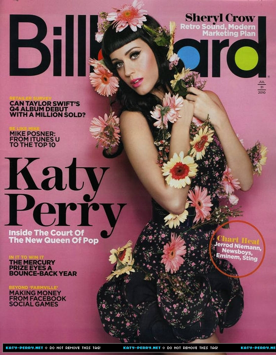
As my magazine will focus mainly on up and coming bands this will also open up new ideas and inspirations to the public, whereas Billboard will feature particularly famous people. NME has a mix of both of these and I have taken a lot of inspiration from this magazine for my draft, I think the success of NME is something to look further at and work out why it's such a huge name now.
Similarly to Billboard, my magazine will have little writing down one side of the cover; I think this stands out well and outlines the image in the centre of the page. However Billboard is an American based magazine and has been produced for more than the last 100 years, they feature the top selling albums worldwide whereas my magazine will focus on new, fresh music.
Sunday, 6 February 2011
Camera Angles/Shots:


Close-up: A close up image is when the frame of the photo is taken up almost entirely by the person/object/feature of the image; in this case it's a person's face. Close ups work well in magazines as it allows extra detail on images showing the reader more, for example if there is an article on a new up-coming celebrity they may well have a close up image to show the audience their face so they become memorable. I have used a close-up image on the contents and double page spread pages of my draft, this is because the band I am focusing on are new to the world of music and the audience of my magazine will recognise them in future if I add in close-up shots.


Mid-shot: As demonstrated in the two images above, a mid-shot is where the feature in the photo is visible from roughly the waist upwards; this is a common profile shot of someone - as used in the 'dirty glam' magazine shown above. The image above that is one that I have taken for my test shots, I played around with different shot lengths to see what would work best for my magazine genre and style, I like this type of image a lot particularly as I am featuring a band rather than a solo artist.


Long shot: I like long shots but I haven't taken any for my test shots as it wasn't suitable for how I wanted my pictures to be set up, the two magazine covers above work really well with long shots as it adds detail in a different way. A typical long-shot could be the whole body or from the legs upwards, they would both come under the category of long-shot. I particularly like the NYLON magazine cover as the image works well among the busy writing, the dark colours contrast with her skin tone in the photo which causes a great contrast for this long-shot.
Wednesday, 2 February 2011
Dazed & Confused Cover:

I really like this front cover as the layered text and images work really well; I may use a similar layout to this with the text over the middle of the image in a neutral colour as it attracts enough attention for people to read it but not too much that it overrides the image. I also like the colour palette of greys and creams as they compliment each other well; the title works really well in a darker grey over the pale grey/off white background as it's layered behind the picture. The font all ties in well with the curved, natural image with minimal editing or effects on it. The bar code is slightly oversized in my opinion but other than that I think this magazine cover works really well from studying all its factors; I am particularly fond of Dazed & Confused covers as they are always individual and different.
Kerrang! Double Page Spread Analysis

I have looked at many double page spreads but I have picked this out as one that I like the most; I think the colour palette of reds and blacks works really well together and it reflects the genre of the band. I like that the main image stretches over both pages and the title is beneath it. Two thirds of the double page is taken up by image and title which leaves just the right amount for the article; when I produce my article on my double page spread I will have to rearrange it so it fits in around the image as that will be the key focal point on the pages. The image is very controversial but this works as it's in Kerrang!'s magazine, which is aimed at an audience of around the age of 16+, similar to mine so I could use factors like this to take advantage of the age range and make it specifically targeted for my age range.
Golden Triangles + Spiral

I looked into the spiral shape of an image and realised it worked with one of my test shots so I tried to show this through Photoshop, I have drawn on a spiral shape showing the movement of the eye as it looks at the picture. Typically the eye could start at either end of the spiral in this case as both ends have a similar colour scheme and inbetween the colours blend together. I think this works really well on magazines as it causes the reader to visually take in the picture if there's a particular system to it. I may use this on my double page spread as I would like the images to stretch across two pages and doing this could create the effect in a more obvious way.

I also tried looking at the rule of thirds in images splitting it up into three parts; in this example one third is the face of the model, the second is the strings of the guitar and her hand and the third is mostly an empty space. These are the three sections of the image, they all have a slightly different colour scheme but without the triangles they all blend together well. I might use this technique on my front cover having the image in one third, the second being the text and the final third being an open space as this is appealing on a front cover.
Subscribe to:
Posts (Atom)