Showing posts with label analysis. Show all posts

Thursday, 17 February 2011

Grading my Draft:

I think I would give my final draft a level 3 because the layout is consistent and the font links the pages together, it would probably stand out due to the bold image on the cover. However it isn't a level 4 because it still needs improvements due to gaps in the layout and article. I have written questions on a previous post and recieved some feedback via blogger comments, I am going to ask peers who don't take Media as an AS level as well to vary the feedback.

When I recieved my teacher assessed feedback it was also a level 3, this can be improved by the following things:
  • add some form of detail to the masthead on my cover page, as it could stand out more
  • make the contents page layout more interesting (text and numbers)
  • double page spread - columns? less boxy?
  • more model-like images for the final magazine (like the black and white one on DPS)
For my Research and Planning work on my blog I recieved a level 4, this could still be pushed up to full marks by using other software to present ideas on my blog, such as Animoto or Prezi.

Wednesday, 9 February 2011

Draft Feedback (Peers):

  1. What do you like about the magazine cover?
  2. How can you tell it's a music magazine?
  3. Is the contents page lay-out suitable?
  4. Do the cover, contents and double page link together? Why?
  5. What would you change about any of the magazine?
  6. Would you pick it up from a shelf? Why?

Monday, 7 February 2011

Market Research:

 
This is an example of a music magazine that is already on the market, NME is an extremely successive indie-alternative-rock magazine and is sold all across the UK. My magazine should hopefully be successful in the same way, a large population of the country are between the ages of 16 and 35, this is roughly the age range my magazine is aimed at. Indie-alternative music has recently escalated in popularity so the genre of my magazine is spot-on for current music interests.
My idea is different because the cover will always be simple with the same plain header so that the image catches the eye rather than the title; I think my design of the grey-scale base colours with two or three brighter colours to contrast this works exceptionally well.
As my magazine will focus mainly on up and coming bands this will also open up new ideas and inspirations to the public, whereas Billboard will feature particularly famous people. NME has a mix of both of these and I have taken a lot of inspiration from this magazine for my draft, I think the success of NME is something to look further at and work out why it's such a huge name now.
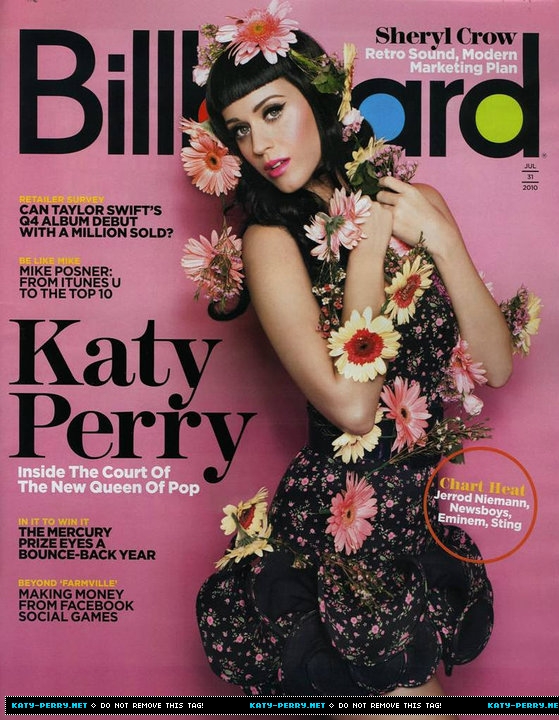
Similarly to Billboard, my magazine will have little writing down one side of the cover; I think this stands out well and outlines the image in the centre of the page. However Billboard is an American based magazine and has been produced for more than the last 100 years, they feature the top selling albums worldwide whereas my magazine will focus on new, fresh music.

Wednesday, 2 February 2011

Kerrang! Double Page Spread Analysis


I have looked at many double page spreads but I have picked this out as one that I like the most; I think the colour palette of reds and blacks works really well together and it reflects the genre of the band. I like that the main image stretches over both pages and the title is beneath it. Two thirds of the double page is taken up by image and title which leaves just the right amount for the article; when I produce my article on my double page spread I will have to rearrange it so it fits in around the image as that will be the key focal point on the pages. The image is very controversial but this works as it's in Kerrang!'s magazine, which is aimed at an audience of around the age of 16+, similar to mine so I could use factors like this to take advantage of the age range and make it specifically targeted for my age range.

Thursday, 20 January 2011

25 Word Pitch: Feedback

I recieved 5 comments off other members of the class, they all said similar things:
- 'I rather like your close-up idea...'
- 'I think you need to represent that it is a fashion and music magazine...'

- '...unsual aspect to it'

I have taken this feedback and tried to use it to my best advantage, I am making the title of the magazine revolve around music to ensure that the genre of the magazine is obviously music. I am still unsure on the title however as 'Rewind' could sound too technological and modern for my acoustic-style music magazine; I will continue looking for the perfect name. As my magazine revolves around music and fashion I will tie in the fashion on the double page spread and contents pages, this will make sure the audience know what's included after flicking open the first page. As for the title font I will keep the idea of a neutral colour against the brighter, bolder background colours, one person mentioned they liked this idea and others said it was unique.

Tuesday, 18 January 2011

Analysis of test shots:

As I have taken a fair amount of photos I have chosen my favourite shots and have looked at what will work best for my magazine. I have decided to stick with my original idea of a close-up half-face on the front cover and I will create a mock-up of what I want this to roughly look like. On the contents I will just various sections of photos and apply them as a border, with one group feature photo as the main image and the text surrounding this central image. Again, on the double page spread I will use various images of the "band" of three people whilst sticking to a colour scheme but adding flashes of other colours to brighten the page up. The three people the "band" consists of each have a different colour of hair, I wanted to do this from the start as it means the images will be eye catching.

Thursday, 13 January 2011

About My Magazine:

About my magazine;
The audience for my magazine will be from the age of 16+, they would typically have a keen interest in indie/alternative music and a side interest in fashion.
The font will be big but in a scribbled font so it appeals to a younger audience as well as more mature people. I would like the colour of the title to be white as my background will be busy, however I may make changes to this when I make my actual product.
The music featured in my magazine will be similar to the likes of The Foals, Arctic Monkeys, Two Door Cinema Club and Ellie Goulding.
The front cover of my magazine will feature a close-up image of a girl’s face, with the emphasis on the eye; this means I can use Photoshop to change the colours of the eye and adapt the make-up on her face. I will also use Photoshop to show that my magazine is music based by putting an instrument in the reflection of the pupil of the eye.
These are some magazines I have looked at for inspiration;
Jess Pardoe